Editor guide
Select and inspect
Click something in your prototype, then read what it is, its options, and where its style really comes from.
Selecting is how you tell Editor what to work on. Click something, and the Inspector, the panel on the right, tells you what it is: which component it is, the options it accepts, and where its colors and spacing actually come from. Every change described in Making changes starts with a selection.
Select something#
Pick Select from the tool picker in the toolbar under the header. Until you do, clicks go to your prototype like normal and nothing selects. See A tour of the Editor for why Navigate is the tool picker's default.
With Select active, you can pick something three ways:
- Click it in the prototype. Hovering outlines the element under your cursor. Clicking it selects it, and the Inspector opens in the Edit tab of the right rail.
- Click its row in the Structure tree, the outline of the page in the Edit tab of the right-hand panel. This works even for something small or hidden behind something else.
- Click an ancestor's row. The Structure tree keeps the rows above your current selection expanded, so you can select a parent or grandparent without hunting for it.
Right-clicking an element in the prototype also offers a text field that starts a new chat about it. The element is already the selection, so the AI gets it as context automatically.
Press Escape to clear the selection. It is ignored while you are typing in a field or while a dialog is open, so it will not throw away work you are in the middle of.
What you selected: a component or a plain element#
The name at the top of the Inspector tells you which of two things you picked.
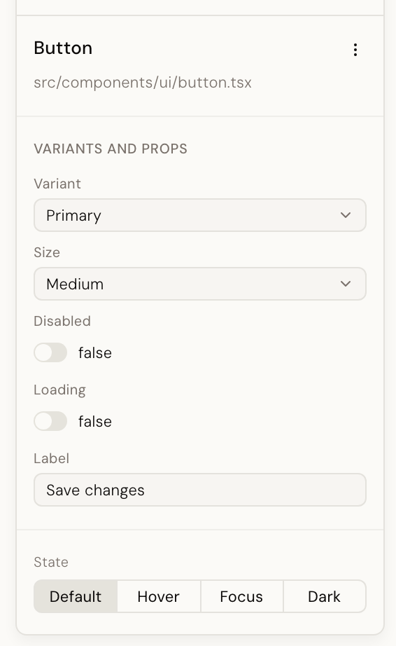
A component is a reusable piece of your design system, a button or a card, that shows
up in more than one place. Select one and the name is the component's own name, such as
KButton, with the file it is defined in shown underneath.
A plain element is an ordinary piece of markup, like a div, that is not its own
component. Select one and the name is just the tag. There is no source file to show,
because there is no component to point at.
The difference matters for what you see next: a component gets a Variants and props section for its options, and a plain element does not.
The Structure tree#
Above the Inspector, the Structure panel mirrors your prototype's tree the way a layers panel mirrors a design file. Components appear in the accent color, plain elements in gray, text in lighter italic gray. A component's package name appears on the right when it comes from a library.
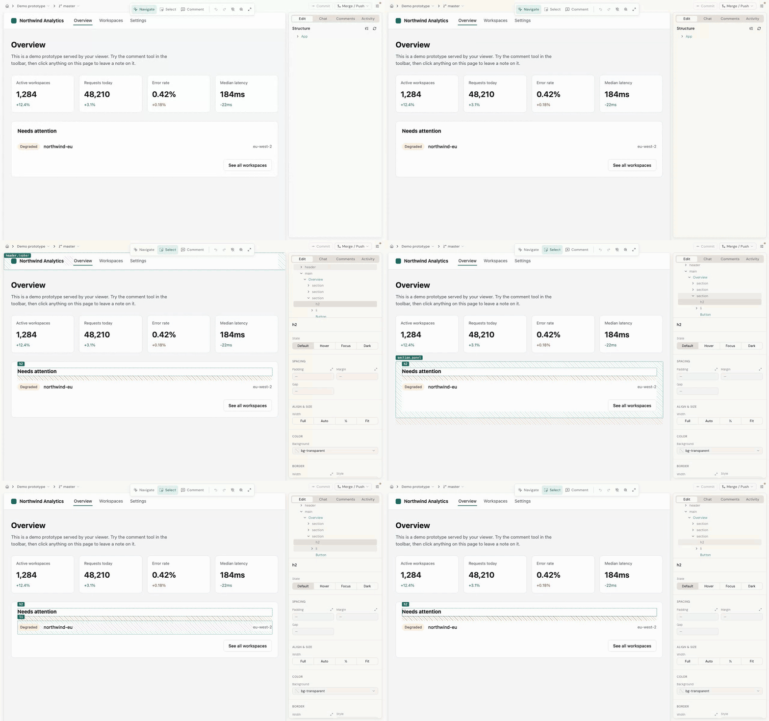
Selection works both ways: click a row to select that element in the prototype, or click an element in the prototype and its row lights up in the tree. Hovering a row outlines the element in the prototype without selecting it, which is a quick way to check what a row actually is before you commit to it. The refresh button re-reads the tree if the page has changed underneath you.
Reading the Inspector#
The Inspector only shows the sections that apply to what you selected. A plain element, for instance, never gets a Variants and props section.
Identity#
The name and source file described above, plus a menu next to the name. Edit component opens the component on its own, rendered once per variant, so you see every version of it at a glance instead of just the one on this page.
Variants and props#
A prop is a named option a component accepts, such as its size or whether it is disabled. This section shows one row per option, with a control that matches its type: a switch for yes or no, a dropdown for a fixed set of choices, or a text field for anything else. A dropdown lists exactly the values the component accepts, so you cannot pick one that does not exist.
Objects, arrays, events, functions, slots and token props are shown read-only for now.
These options come from your design system itself, which is why they match what your engineers use. When Editor does not have that information for a component, you get a plainer Props section instead, listing whatever values are currently set as plain text.
Style, and where a value comes from#
A State bar sits above the style controls: default, plus hover, focus, and
dark. Pick one and every control below it edits that state instead of the resting look,
so you can style a hover effect without disturbing the default appearance. A dot marks a
state the element already has changes for.
The sections below the State bar cover spacing, colors, borders, typography and shadows, and are described in Making changes.

Under a value you may see a From: line. A design token is a named value, like a shade of blue, that your design system defines once and reuses everywhere. The From line tells you where the value you are looking at actually came from: a token, a rule set further up the page, or the element itself. It exists because guessing backwards from a rendered color to "which token is this" produces confident wrong answers. Click it for the full chain. This is also what decides whether changing that value asks you a question first; see Making changes.
DOM and text#
This section is labeled DOM, short for the Document Object Model: the actual elements
the browser has built for this part of the page. It holds every piece of editable text on
the element, plus a Classes field holding the element's class list. Text that renders
read-only carries a short reason: Editor can see the words but cannot safely trace them back
to one place in your source. Fallthrough
attributes the parent passed in but the component does not formally declare, such as
placeholder, show up in their own Attributes section, editable the same way.
If the text shows one thing or another depending on a condition, a Conditional text section appears instead, with one field per branch, so you can edit each version of the copy separately.
Swap, Detach and the icon picker are off by default#
Three controls, Swap component, Detach component, and the icon picker (which
replaces one icon with another), are off by default and will not appear at all. Two
settings bring them back: lanes.detach for Detach, and lanes.swap for Swap. The icon
picker returns with lanes.swap too, because picking an icon is a swap. See
editor configuration for where those settings go.
When Detach is on, it is only offered for components written in your own repository. Desde never rewrites a library's files.
Good to know#
An element Desde cannot trace back to a source file can still be inspected, but not changed. This is usually something rendered by a library rather than your own code. See When Desde says no for the rest of what Editor refuses, and why.
Next#
- Making changes: use a selection to change the words, the variant, the style, or the structure
- When Desde says no: what Editor cannot select or change, and why